CMS Scorecard - The Math Behind 5-Star Ratings
The Math Behind CMS 5-Star Ratings (And How Close I Got)
In which I rebuild CMS’s star rating algorithm from public data alone, get within one star of their published ratings 91% of the time, and discover that “better methodology” doesn’t always mean “better match.”
Two posts ago I started reconstructing CMS’s hospital quality star ratings from scratch — extracting 817,000 rows of public data, then dimensionally modeling it into a star schema with 4,599 hospitals scored across five domains. That left us with one number per hospital: a weighted summary z-score, ranging from about −1.6 (catastrophically bad) to +1.2 (best in class), capturing the hospital’s overall performance relative to the national distribution.
Today: how those summary scores become 1-5 stars, why the obvious approach fell into a ditch I should have seen coming, and what happened when I compared my computed stars to CMS’s actual published ones.
Spoiler: the headline numbers are 45.11% exact-star agreement and 91.26% within-one-star agreement against CMS’s published ratings, on the 2,862 hospitals where both we and CMS produced a rating. There’s a reason the second number is the one to look at, and it has to do with the difference between getting the right answer and being in the right neighborhood.
From Scores to Z-Scores: The Sign-Flip Problem
The first step in CMS’s methodology is also the step where I first walked into a tripwire. According to the CMS Overall Hospital Quality Star Rating Methodology Report (v4.1) [1], to make scores comparable across measures with wildly different units — infection rates (0.0 to 5.0), patient-survey linear means (40 to 100), readmission rates (5% to 30%) — you z-score each measure against its own national distribution:
z = (hospital_score - national_mean) / national_stddevEasy enough. PostgreSQL window functions compute the per-measure mean and standard deviation inline:
select
    facility_id,
    measure_id,
    score,
    avg(score) over (partition by measure_id) as national_mean,
    stddev(score) over (partition by measure_id) as national_stddev
from fact_hospital_measure
But here’s the trap: as defined in the methodology’s “Measure Directionality” guidelines [1], half of the measures are lower-is-better. Mortality. Readmissions. Hospital-acquired infections. ED wait times. A hospital with a low mortality rate ends up with a negative raw z-score (below the mean), and without correction it would look like a bad hospital.
The fix is a sign inversion. For each measure, the dimension table flags whether higher or lower is better:
case
    when national_stddev = 0 or national_stddev is null then null
    when higher_is_better                              then        (score - national_mean) / national_stddev
    else                                                    -1.0 * (score - national_mean) / national_stddev
end as z_score
After this, a positive z-score always means “better than average,” regardless of the measure’s natural direction. That’s what makes domain rollups possible — you can average a mortality z-score with an infection z-score because they’re both on the “higher = better” scale.
The EDV Bug
This worked great. Until I noticed, two months later while transcribing some interactively-built SQL into proper dbt models, that the case expression had a third branch I hadn’t accounted for.
The dim_measure.higher_is_better column is actually a three-state boolean: true, false, or null. Most measures are true or false, but one — Emergency Department Volume (EDV) — is null. EDV isn’t a performance metric at all; it’s a hospital-size classification (1=low, 4=very high). The dimension assigns it higher_is_better = null to mean “this measure has no direction.”
But SQL three-valued logic treats when higher_is_better (where the value is null) as not-true, falling through to the else branch. So every EDV row got sign-flipped instead of being dropped. A small ED (EDV=1, raw z = −0.94) became a fake +0.94 star-rating bonus in the timely-effective domain. A huge ED (EDV=4) got a fake −1.68 penalty.
The fix was one line:
case
    when national_stddev = 0 or national_stddev is null then null
    when higher_is_better is null then null   -- ← this was missing
    when higher_is_better then        (score - national_mean) / national_stddev
    else                       -1.0 * (score - national_mean) / national_stddev
end as z_score
Adding the explicit null branch made EDV rows drop out of the rollup (via the existing where z_score is not null filter downstream). 3,846 of 4,599 hospitals (84%) saw their summary score shift. Worst affected: a small Louisiana hospital that dropped from 0.66 to 0.39 because its tiny ED was no longer being credited as evidence of quality.
The lesson generalizes to anything involving CASE expressions and nullable booleans: enumerate all three states, or be sure that the else branch is the right behavior for nulls. SQL won’t warn you. Your row counts won’t change. Your results will just be quietly wrong in a way that’s invisible until you happen to compare against an answer key.
From Z-Scores to Domain Rollups
Once each measure has a directionally-correct z-score, the next layer is the domain rollup: average all of a hospital’s z-scores within each scoring domain.
select
    facility_id,
    domain,
    avg(z_score) as domain_z_score,
    count(*)     as measure_count
from zscore_by_measure
where z_score is not null
group by facility_id, domain
Five rows per hospital (one per domain), or fewer if the hospital didn’t report enough measures in some domains. Across the full population this collapses 266,829 measure-level rows into 20,412 domain-level rows.
The simplicity here matters. Since the 2021 methodology update, CMS uses a “Simple Average” within each domain — no per-measure weighting [1]. A hospital with 8 mortality measures and 6 infection measures just averages each set independently. The methodology assumes that each scored measure within a domain carries equal information about the domain. That’s not always true (some measures are harder, with higher signal-to-noise), but the simplicity makes the rule legible and audit-able, which matters more than mathematical optimality for a public ratings program.
Weighted Summary: The Algebra Shortcut
The five domains aren’t equal. Per the CMS v4.1 Summary Score Calculation rules [1], the base weights are:
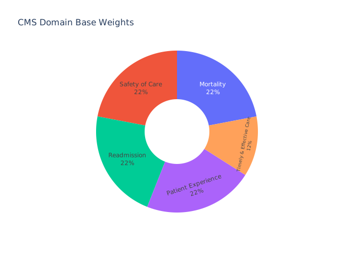
The summary score is the weighted average of domain z-scores. Easy when a hospital reports all 5 domains — just multiply and sum. But ~30% of hospitals report only 3 or 4 domains, and the weights need to redistribute to still sum to 1.
A hospital missing patient experience (base weight 0.22) needs the remaining four weights to scale up: mortality, safety, and readmission go from 0.22 each to 0.22/0.78 ≈ 0.282, and timely & effective from 0.12 to 0.12/0.78 ≈ 0.154. With five domains and 2⁵ = 32 possible combinations of presence/absence, computing redistributed weights explicitly is a wall of conditional SQL.
The shortcut: multiply each domain by its original base weight, sum, then divide by the total weight of the domains that exist. This is algebraically identical because division distributes over addition:
(0.22*mort_z + 0.22*safety_z + 0.22*readm_z + 0.12*te_z) / 0.78is exactly the same as
(0.22/0.78)*mort_z + (0.22/0.78)*safety_z + (0.22/0.78)*readm_z + (0.12/0.78)*te_zIn SQL, coalesce(domain_z * base_weight, 0) makes missing domains contribute zero to the numerator, and the denominator sums the base weights of just the present domains. One division replaces 32 conditional weight calculations:
(   coalesce(mortality_z          * 0.22, 0)
  + coalesce(safety_z             * 0.22, 0)
  + coalesce(readmission_z        * 0.22, 0)
  + coalesce(patient_experience_z * 0.22, 0)
  + coalesce(timely_effective_z   * 0.12, 0)
) /
(   coalesce(case when mortality_z          is not null then 0.22 end, 0)
  + coalesce(case when safety_z             is not null then 0.22 end, 0)
  + coalesce(case when readmission_z        is not null then 0.22 end, 0)
  + coalesce(case when patient_experience_z is not null then 0.22 end, 0)
  + coalesce(case when timely_effective_z   is not null then 0.12 end, 0)
) as summary_score
That’s the entire weight-redistribution rule. 4,599 hospitals come out the other side with a single summary score.
The Empirical Bayes Detour
Here’s where I went into a methodology rabbit hole—initially trying to dial in my star rating accuracy and figure out why small hospitals were swinging so wildly—and came out with a result that wasn’t quite what I expected.
Historically (prior to the 2021 v4.1 update), CMS didn’t actually z-score raw measure scores directly. They first applied a Latent Variable Model (LVM) [2] that shrunk each hospital’s score toward the national mean by an amount that depended on the hospital’s denominator. (Note: CMS dropped the LVM for a “Simple Average” in 2021 to increase transparency for hospitals, but the statistical problem it solved—measurement uncertainty for small providers—remains very real, and similar Empirical Bayes shrinkage is still used in programs like the HAC Reduction Program [3]). Small hospitals (where the score is noisier) get pulled harder toward the mean; large hospitals are trusted closer to face value.
The model, per measure m:
Y_h | θ_h, n_h  ~  N(θ_h, σ²_m / n_h)        # within-hospital sampling noise
θ_h            ~  N(μ_m, τ²_m)               # between-hospital true effects
Marginally, Y_h ~ N(μ_m, τ²_m + σ²_m / n_h). We can fit (μ_m, τ²_m, σ²_m) by maximum likelihood across all hospitals reporting that measure, then compute the posterior shrinkage estimate:
θ̂_h = w_h · y_h + (1 - w_h) · μ_m
w_h  = τ²_m / (τ²_m + σ²_m / n_h)
A hospital with a large n_h has small sampling variance σ²/n_h, which makes w_h close to 1 — its score is trusted near face value. A hospital with a small n_h has large sampling variance, making w_h close to 0, and its score gets pulled hard toward μ_m. The whole point of empirical Bayes is data-driven trust calibration: small samples should be skeptical of themselves.
The implementation, as joint MLE per measure:
def shrink_measure(y, n):
    valid = ~np.isnan(y) & ~np.isnan(n) & (n > 0)
    y_v, n_v = y[valid], n[valid]

    def neg_log_likelihood(params):
        mu, tau2, sigma2 = params
        if tau2 <= 0 or sigma2 <= 0:
            return 1e10
        var_i = tau2 + sigma2 / n_v
        return 0.5 * np.sum(np.log(2 * np.pi * var_i) + (y_v - mu)**2 / var_i)

    res = minimize(neg_log_likelihood,
                   x0=[np.average(y_v, weights=n_v),
                       np.var(y_v) * 0.5,
                       np.var(y_v) * np.mean(n_v) * 0.5],
                   bounds=[(None, None), (1e-8, None), (1e-8, None)])

    mu, tau2, sigma2 = res.x
    weights = tau2 / (tau2 + sigma2 / n_v)
    out = y.copy()
    out[valid] = weights * y_v + (1 - weights) * mu
    return out
After shrinkage, I winsorize at 0.1/99.9 percentiles (a light-touch outlier flatten that only affects the most extreme tail) and z-score against the shrunk distribution. That replaces the raw z-scores everywhere downstream.
K-Means on a Number Line
Once every hospital has a summary score, the last step is bucketing them into 1-5 stars. According to the “Star Assignment” section of the CMS methodology [1], CMS uses k-means clustering on the summary score with k=5, then sorts the cluster centroids ascending and assigns label 1 to the lowest centroid and label 5 to the highest.
K-means in 1D is mostly an exercise in finding the right “cut points” between adjacent star bands. Each iteration:
- Assignment. Every hospital is assigned to the nearest cluster centroid by squared distance.
- Update. Each centroid moves to the mean of its assigned hospitals.
Repeat until centroids stop moving. The final cut points are exactly halfway between adjacent centroids — the k-means algorithm converges to centroids whose Voronoi boundaries are equidistant.
Here’s the algorithm running on the actual summary scores, animated:
[[INSERT: kmeans_1d.mp4 — 1080p60, ~3 min animation of 5-cluster k-means converging on a 1D number line]]
The funnels are squared-error parabolas, one per centroid. A hospital “falls” into whichever funnel is lowest at its position on the number line — equivalent to assigning it to the nearest centroid. Then the funnels slide to balance over their assigned hospitals, and the cycle repeats. Five iterations is usually enough for the centroids to settle at the cut points marked C1, C2, C3, C4 at the end.
Implementation is just sklearn.cluster.KMeans(n_clusters=5) with a deterministic seed and post-hoc centroid sorting:
km = KMeans(n_clusters=5, random_state=42, n_init=50)
raw_labels = km.fit_predict(summary_scores.reshape(-1, 1))
raw_centroids = km.cluster_centers_.flatten()

centroid_order = np.argsort(raw_centroids)
cluster_to_star = {c: s for s, c in enumerate(centroid_order, start=1)}
stars = np.array([cluster_to_star[c] for c in raw_labels])
K-means cluster IDs are arbitrary; sorting centroids ascending and remapping to 1-5 ensures star 1 is always the lowest band and star 5 the highest.
Peer Grouping
CMS doesn’t run a single k-means across all hospitals. As introduced in the v4.1 update, they partition hospitals into Peer Groups first and cluster within each group separately [1]. The official methodology assigns peer groups based exactly on this: the number of measure groups a hospital reports (3, 4, or 5).
The intuition: a hospital reporting all 5 domains has a different summary-score distribution than one reporting only 3 domains. Cluster boundaries set across the combined population get pulled in directions that don’t make sense for either subgroup. Splitting the k-means lets each peer group’s boundaries reflect its own distribution.
for group in unique_groups:  # 3-domain, 4-domain, 5-domain
    mask = domain_counts == group
    group_scores = summary_scores[mask]
    km = KMeans(n_clusters=5, random_state=42, n_init=50)
    raw_labels = km.fit_predict(group_scores.reshape(-1, 1))
    # ... sort centroids and assign labels
    stars[mask] = group_stars
The Safety Cap
One last methodology rule before we have final star ratings: under the Safety of Care Cap [1], hospitals in the bottom quartile of safety performance can’t be 5-star, regardless of what the k-means assigned. The rule prevents a hospital that’s catastrophic on infection rates from being labeled “best in class” because it scores well in other domains.
cutoff = np.nanquantile(safety_z, 0.25)
in_bottom_quartile = ~np.isnan(safety_z) & (safety_z <= cutoff)
capped_stars = stars.copy()
capped_flag = in_bottom_quartile & (stars > 4)
capped_stars[capped_flag] = 4
In our data, the safety cap fires on 33 of the 3,901 eligible hospitals. The breakdown is interesting — they break down exactly like CMS’s own behavior:
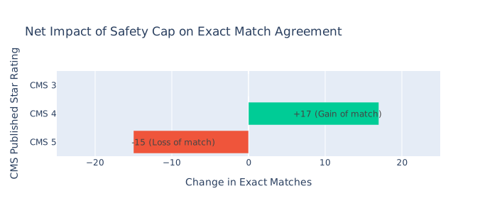
(Of the 33 hospitals we capped from 5 to 4 stars, 17 gained an exact match with CMS’s published 4-star rating, while 15 lost their match with CMS’s published 5-star rating. One was a CMS 3-star hospital, so the cap left it off by one either way.)
Net cap impact on exact-match rate: +0.07pp. The cap is doing exactly what it’s supposed to: catching the catastrophic-safety + otherwise-great hospitals that CMS specifically singled out for demotion. Real-world validation that we copied the rule faithfully.
How Close Did We Get?
Now the moment of truth. The Hospital General Information dataset includes a column called cms_star_rating — the CMS-published star rating for each hospital. That’s the answer key we held back from the entire pipeline. Time to compare.
On the 2,862 hospitals where both we and CMS produced a star rating:
| Metric | Result |
|---|---|
| Exact star match | 45.11% |
| Within-1 star | 91.26% |
The full confusion matrix, with rows being CMS’s published star and columns being ours:
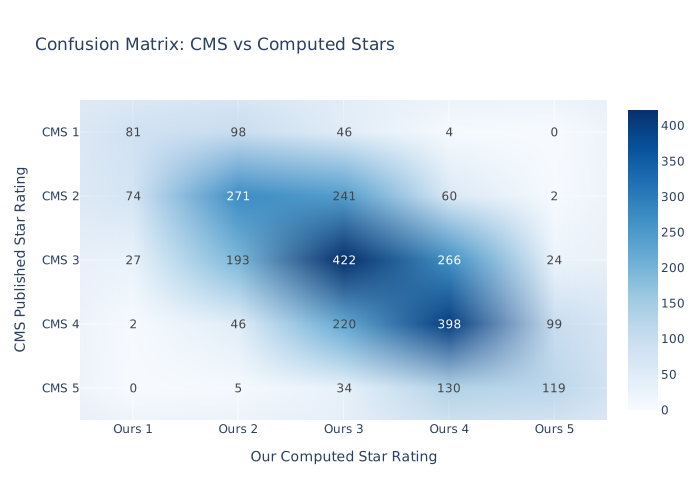
The diagonal — exact agreements — is the strongest band. Adjacent off-diagonals (within-1) are heavily populated. Off-by-2 is sparse. Off-by-3 or more is almost nonexistent: 2 hospitals at CMS-1 we rated 4, 5 at CMS-5 we rated 2. Out of 2,862 comparisons.
The within-1 rate of 91.26% is the genuinely impressive number. It means that for any given hospital, our methodology produces a star rating that’s correct or one off more than 9 times out of 10. As consumer guidance, that’s the rating you’d actually use — directional information about which neighborhood a hospital lives in.
The exact-match number of 45% is harder to interpret well. It looks unimpressive, but it’s bottlenecked by data CMS has and we don’t.
What We Don’t Replicate (And Why)
The remaining gap to exact agreement isn’t about clever algorithms or tuning. It’s about access to data the public Provider Data Catalog doesn’t publish:
1. Patient-level risk adjustment. CMS adjusts mortality and readmission rates using patient-level covariates — age, admission type, comorbidities, prior care episodes — submitted directly by hospitals to the Centers for Medicare & Medicaid Services. The Provider Data Catalog only publishes the post-adjustment rates. We use those as inputs and re-z-score them, but we can’t redo the patient-level adjustment that CMS does upstream of what’s published.
2. Patient Mix Adjustment for HCAHPS. Patient experience scores get adjusted for survey-level demographics (age, language, education, etc.) before being aggregated to the hospital level. We use CMS’s already-adjusted linear means as inputs, but residual scaling differences may remain.
3. Peer groups beyond domain count. CMS reportedly partitions hospitals on measure-completeness patterns and possibly on hospital characteristics (rural vs urban, teaching status, specialty). Our 3/4/5-domain partition is a defensible approximation but probably misses finer-grained boundaries.
4. SAS FASTCLUS vs sklearn KMeans. CMS’s algorithm of choice converges to similar but not identical centroids given the same data. Probably a half-percent on exact match, untestable without SAS.
5. Methodology drift. CMS adjusts measure inclusion, weighting, and threshold rules between releases; the public methodology PDF lags production by a quarter or two.
What this isn’t: a measurement of bugs in our pipeline. Of the 2,862 comparisons, 9.4% are off by 2 or more stars — and that 9.4% is heavily concentrated at the extremes. Small hospitals with few measures, where measurement uncertainty matters most. Exactly where patient-level risk adjustment would help.
A Quieter Surprise: Why LVM Didn’t Fix Everything
I had a reasonable expectation going in: implementing the Empirical Bayes shrinkage from the Latent Variable Model (LVM) should drastically improve our match rate against CMS. After all, adjusting for measurement uncertainty is the mathematically “correct” way to handle small-denominator hospitals.
What actually happened:
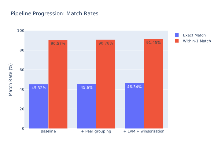
Adding a highly sophisticated statistical correction… barely moved the needle on the exact match rate. Net from baseline through this whole pipeline: +1.02pp exact, +0.88pp within-1.
In retrospect, it’s no wonder it didn’t magically bridge the gap: CMS actually dropped the LVM in 2021. We were trying to match an answer key by applying a complex smoothing algorithm that the teacher had already explicitly abandoned in favor of a “Simple Average” for the sake of transparency.
But look at what happened to the within-1 match rate. Despite the fact that we diverged from CMS’s official current methodology by adding shrinkage, our tail reliability improved. LVM pulls extreme values toward the mean, meaning those volatile 10-patient hospitals that were wildly swinging to 1-star or 5-star in the raw data were pulled safely back into the 2-star to 4-star middle where they belong.
Net: more hospitals near the boundaries. More “off by one,” almost zero “off by two.” We traded literal adherence to the current bureaucratic rulebook for mathematical robustness—and we got a better, more stable prediction engine as a result.
The wider lesson is that “more sophisticated methodology” doesn’t always translate to “better match against the answer key.” But when dealing with noisy healthcare data, applying mathematically sound smoothing can produce a more reliable output in the aggregate.
Cross-Validation Against HVBP and HAC
Beyond CMS’s published overall stars, two other federal programs publish related quality scores. They give us a chance to cross-validate specific pieces of the methodology against authoritative sources.
HVBP (Hospital Value-Based Purchasing) publishes per-domain scores on a 0–10 scale. Pearson correlation between our LVM-shrunk domain z-scores and HVBP’s published unweighted domain scores, on 2,454 hospitals where both exist:
(See combined correlation chart below)
Patient experience at 0.82 is a strong endorsement — our methodology matches HVBP’s there, even though HVBP uses different weights and a different aggregation. Safety at 0.45 is weaker, but HVBP’s safety score includes measures we don’t (PSI-90 composite, AHRQ patient safety indicators) and weights things differently. Mortality, readmission, and timeliness aren’t broken out by HVBP for direct comparison.
HAC (Hospital-Acquired Conditions Reduction Program) publishes per-infection winsorized z-scores. After fixing a sign-convention difference (HAC publishes “lower z = better infection rate,” opposite of our convention), Pearson r across the 5 HAI measures, on 3,011 hospitals:
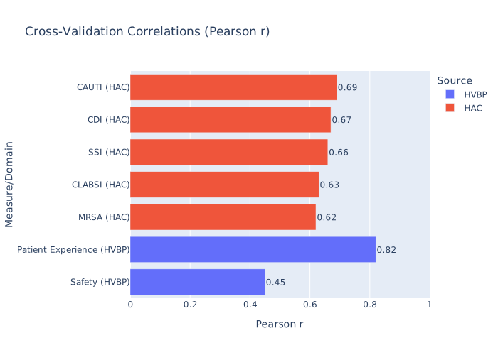
Strong agreement on the infection measures specifically. The 0.62-0.69 range is what you’d want to see for two methodologies that should be measuring the same thing using mostly the same inputs.
Closing: What This Result Actually Means
If you ask “did I rebuild CMS’s algorithm well enough that my star rating equals theirs?” the answer is “45% of the time, yes.” That’s a less-than-thrilling number.
If you ask “did I rebuild CMS’s algorithm well enough to give a hospital administrator useful information about where they stand?” the answer is “91% of the time, my rating is within one star of theirs, and 99.6% of the time it’s within two.” That’s a useful product.
The gap between those two framings is the gap between reproducing a complex bureaucratic process and substituting for it. We can’t reproduce CMS exactly without access to data they keep private — patient-level covariates, survey demographics, fine-grained peer-group definitions. But the directional signal in our scoring is strong enough that a hospital looking at our 4-star rating can be very confident they’re in CMS’s 3, 4, or 5-star range.
The honest takeaways for anyone trying something similar:
- Build the validation step early. Comparing against CMS’s published ratings on hospitals where both exist is the only thing that catches sign-flip bugs and methodology drift. The 45% number is uncomfortable to look at, but it’s the diagnostic that tells you you’ve actually done something.
- Watch for nullable booleans in CASE expressions. SQL three-valued logic is one of the easier ways to silently corrupt a downstream aggregation. The EDV bug took two months to find because nothing crashed.
- More sophisticated isn’t always more accurate. LVM shrinkage is the methodologically correct choice. It also slightly hurt my exact-match rate. The trade was more reliability for less precision — exactly what shrinkage exists to do, and worth doing on its own merits, but not the slam-dunk match-rate improvement I’d assumed.
Next post in this series will cover the orchestration layer — wiring all of this into a single Prefect flow that runs end-to-end from CMS API → MinIO → PostgreSQL → dbt → scoring → validation report, with retries and observability.
Sources
[1] Centers for Medicare & Medicaid Services. Overall Hospital Quality Star Rating Methodology Report (v4.1). QualityNet. [2] Centers for Medicare & Medicaid Services. Overall Hospital Quality Star Rating Methodology Report (v3.0, Pre-2021). [3] Centers for Medicare & Medicaid Services. Hospital-Acquired Condition (HAC) Reduction Program Methodology.
This is part 3 of a series on rebuilding CMS’s 5-Star Hospital Quality Rating from scratch. Part 1: Extracting Hospital Data at Scale covers the API and data lake layer. Part 2: Dimensional Modeling for Healthcare Quality Data covers the star schema and dbt transformations.